Forget the Q-Pair app (although if you're the kind of person who must have both your phone and tablet tunred on when you com home after a day at work, it does work well). And you should also probably forget the IR blaster (I haven't bothered to play with it yet).
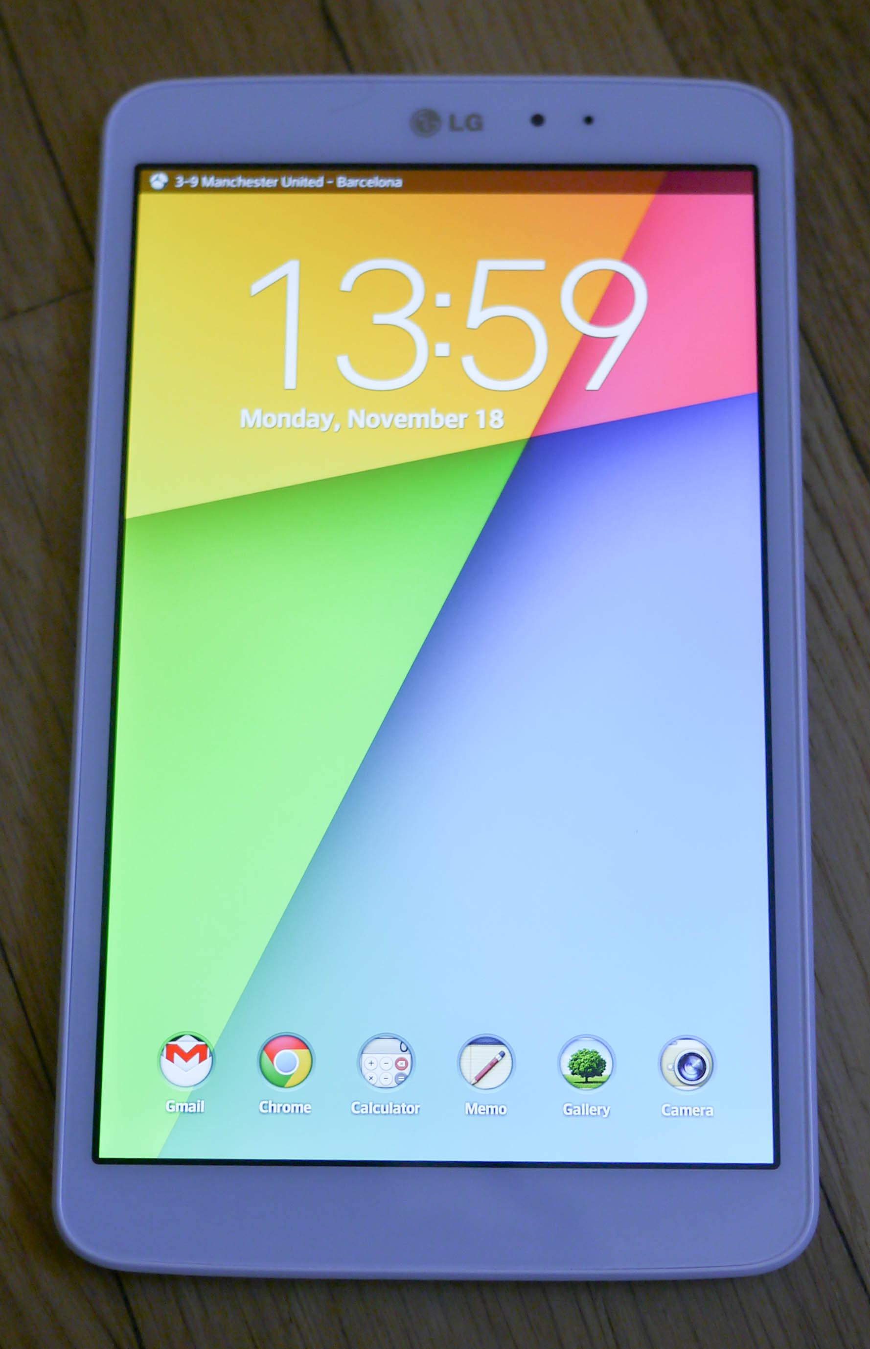
Yes, never mind the extras. The LG V500 (unfortunately named the G Pad) is simply a gorgeous tablet. But with a $349 retail price, is it worth $100 more than the Samsung Galaxy Tab 8.0 or Nexus 7? I would argue that depends on how much it seduces you, and how long you intend to keep it. I know what I've decided. It took just 30 minutes with the tablet to make up my mind. Here's what you need to know.
What's in the box?
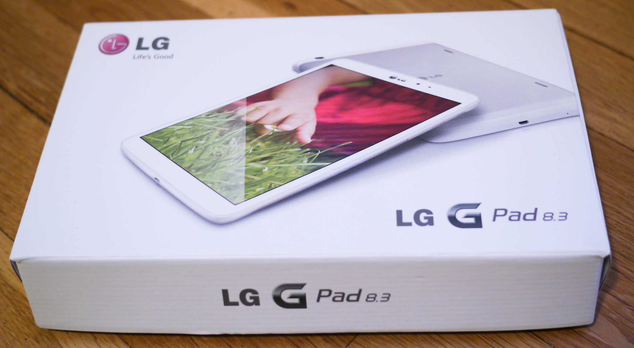
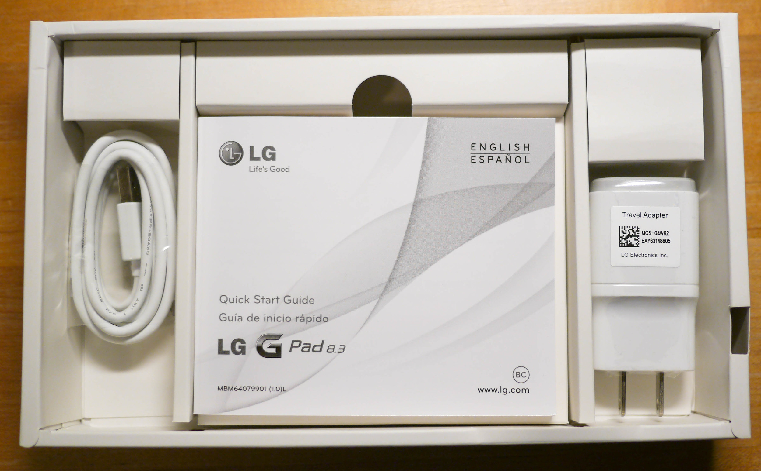
LG keeps it simple. The box has the tablet, a universal Android micro USB charger, and a manual most users will never read.
I have to applaud LG for sticking with the micro USB charging / data port. They could have gone the ASUS or cheap tablet route and used a propriatary cable connection, but a micro USB port means that you can use the same charger to power your Android phone or this tablet. It took a while for Android to catch up to Apple's unified power and data connections, but the four major manufacturers, Motorola, HTC, Samsung, and LG have gotten it together. Wearable devices, like bluetooth headsets, Google Glass, and wristwatches, already use the micro USB charging standard. So while we wait for possible universal wireless charging capabilitires, we Android users have a single stanard to charge all of our mobile devices, just as Apple has the lightning connection to unite its lineup.
What makes it run?
The processor is not the fastest, but it is solid for a device like this. It's a quad core Qualcomm Snapdragon 600, running at 1.7GHz and nearly 2GB of RAM. That's plenty powerful. And the display is top notch. It' a 1920x1200, LED lit display that delivers 273 ppi, more than the Nexus 7's 216 ppi. So it has twice the RAM, and 25% higher resolution as the Nexus 7. Plus it has an aluminum back instead of plastic. Three writers over at Android Central think that's enough to justify the extra $100. I would argue that at the sale price of $299, the extra cost is completely justified.
Performance is simply solid. Some of you care about Vellamo results, so here they are. It's near the top of the current tablet crop.
What makes it special?
A man can hold one of the best tablets on the market in one hand. I admit, I like the 10.1" form factor. It's closer to the size of a magazine. My previous tablet was the ASUS Transformer TF300T. But stepping down to 8 inches was not a rough as I thought it would be. Magazines and books look fine. The LG V500 is light and very portable, like an Amazon Kindle. It's easier to use on a crowded train, and doesn't draw as much attention as an Apple iPad. It's a niche size in between the 7" and 10.1" tablets, and I really like it.
I wish I could say that the battery life is stellar, but I don't yet know for certain. It is not near the Apple iPad perfromance, but to get over six hours at 75% brightness would be nice. Until I'm proven otherwise, I have to say that battery life is about average for a 7 to 8-inch device. Somereviewers have gotten through a full weekend of light use, at low brightness. Needless to say, if you use it to stream HD movies, the battery will not last long. The top of the unit gets the warmest when used continuously.
How is the software?
This is where some fine tuning may be required. LG, like its primary rival, Samsung, is into modifying the Android interface to the point it becomes cluttered with extra features, apps, and custom icons. If you are an experienced Android user, then you probably know that installing a well reviewed launcher can suppress the manufacturer's tinkerings with color schemes and icons. In LG's case, their defaut icons are a little too busy for most people's taste.
The eaiest way to fix this is with a good launcher. No need to root your device. I love Apex Launcher. It lets you revert your icons, appliation tray, and application dock (at the bottom of the screen) to a default Android 4.x appearance, or you can download and install custom icon packs and themes for a completely different look. It's one of the few apps worth paying for, and it can help you make any Android phone or tablet your own. See? It's fixed. It took just a little thought and effort while watching sports on the telly.
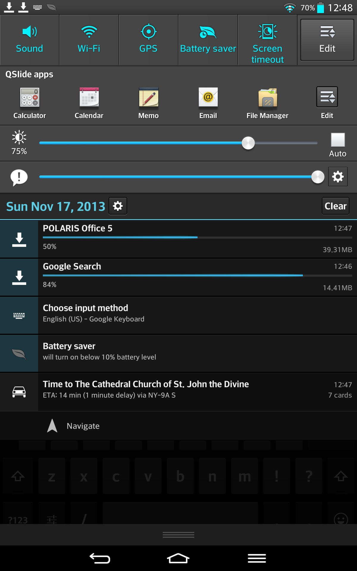
But, alas, there is one thing that you cannot get rid of on the V500, and that is the very busy notification shade.
What is going on there? There are shortcut buttons to adjust sound and brightness in the first row, shortcuts to apps in the second, and then slider controls for brightness and sound in the next two rows. Why have slider cntrols wheh we already have useful shortcut buttons? Some reviewers feel that this is a result of LG trying to one-up Samsung in some twisted war between two Korean manufacturers. Some at Andrid Central have speculated (out loud, in their podcasts) that this is a "Korean" thing, in which logical users interfaces get tossed in favor of flashy extras. Korea is different, to be sure, with it's far superior, much faster mobile networks, and wider array of gandgets that consumers can buy (not unlike Japan). But back to this busy shade.
LG first introduced this shade last year on the Optimus G (which is the phone I use, and love, and call the G1, as that was really the predecessor of their current flagship phone, the G2). However, on the G1, the shade is less busy and I've come to to like it a lot. Here is the shade on the G1 phone. It's clean. I have shortcut buttons to adjust the sound level, brightness, Wi-Fi radio, and airplane mode, and below that, my notifications. I think that's an improvement over stock android, and it isn't annoying at all. It's pretty useful.
While the busier shade of the G2 phone and V500 tablet is less practical, at least the displays of those devices is larger, so you can quickly scoll past the clutter and get to what you want to look at in the first place - your notifications.
But LG still made changes in the second year of ther "G" user interface. The lock screen of the G1 phone is customizable. You can choose a wallpaper, a big clock or calendar overlay, and four apps you can quickly launch by swiping over them. Here are two versions of the G1 lock screen.
With the V500 tablet, and presumably the G2 phone, the ability to choose a clock/calendar graphic to the lock screen is gone. You still choose six icons and the wallpaper, but you only get a big clock at the top of screen. A very minor gripe for me, but I just found it odd that after adding so much to their UI, LG would then take something attractive away from it.
What is this menu button doing here?
Well, there is one other thing that is not quite right with the LG setup. They continue to defy the Android standards guide and use a menu button in the lower right of the screen. It replaces any menu buttons that appear in apps. There's no real harm here. It's just LG being different, just how Samsung insists on replacing the Home button with a physical button on all of its Galaxy phones and tablets. I knew this going in, and I don't mind it as much as Android developers do. It works.
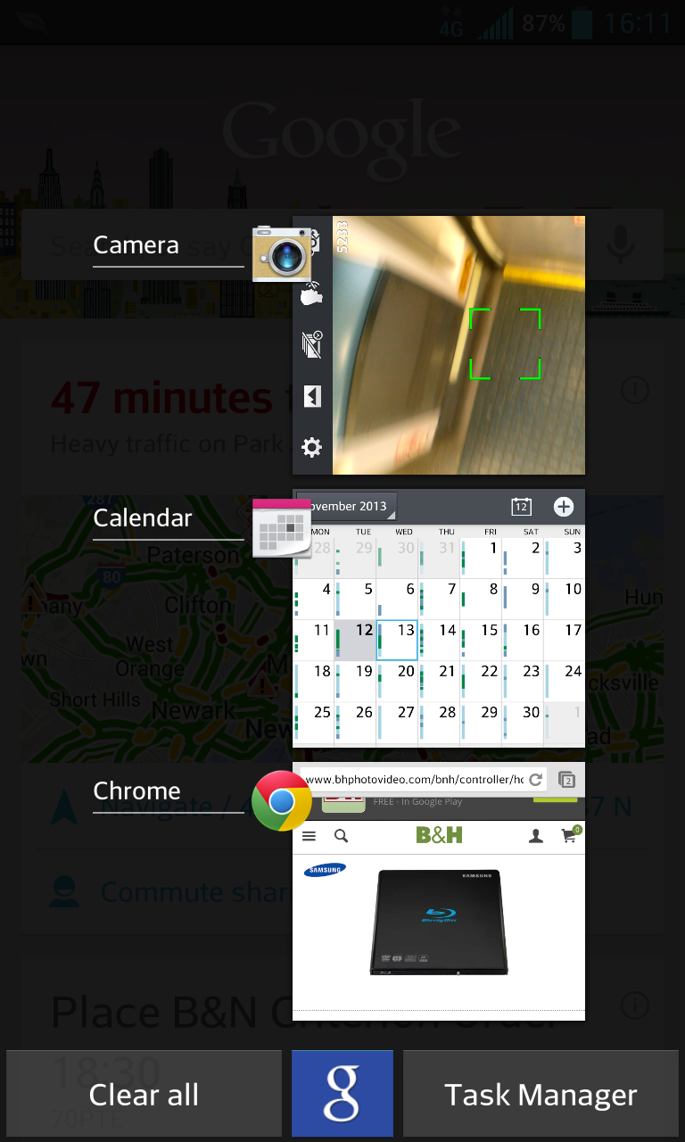
What I wish LG added, however, is the ability to long-press the Home button, which brings up recent apps and the option launch Google Now from there. I have that feature on my G1 phone. LG has taken it away (at least for now) on their new tablet. Here it is on my G1 phone.
Any Accessories?
Not really. LG makes them, but they are not yet available in the US (and they might never get here). They are beginning to appear on eBay. And this fine Korean seller on eBay has colored, grippy hard shells that protrect the tablet's aluminum rear plate. I got one in light blue.
A Google Play Edition!
I was about to close this review by saying that this is the best tablet for under $300 (when on sale). I still think that. But lookey here! Google has just released a Google Play edition of the LG V500 running Android 4.4 Kit Kat for $349. It's available in black only, but it's suddenly the best Andrid tablet on the market, at any price.
The Google Play edition strips out all the of the superfulus LG apps, restores the icons and notification shade to stock Android style, and replaces LG's menu button on the lower right to what Google demands, the "recents" button, which lets you quickly go back to a recently used app.
So if you go for this unique, medium sized tablet, you have two outstanding versions to choose from at different price points: $299-$349 for the LG version in black or white, and $349 for the Google Play version in black. It's the best of what Android does in two distinct flavors, and it's my choice for tablet of the year.
